
Does your marketing create a helpful customer experience, or a frustrating one?
Accessible brand design insights from the Sydney Metro
In Western Sydney we have recently had a driverless Metro line added to our public transport system - yes…. driverless!
One of the stations located near my home sits quite high above street level to allow for traffic to pass underneath. As I was driving past today, I noticed just how high the platform actually was and remembered the last time I had to scale this ‘tower’ to get to the platform at the top.
And of course, the design-nerd in me couldn’t help but see a visual metaphor for accessible brand design right in front of me!
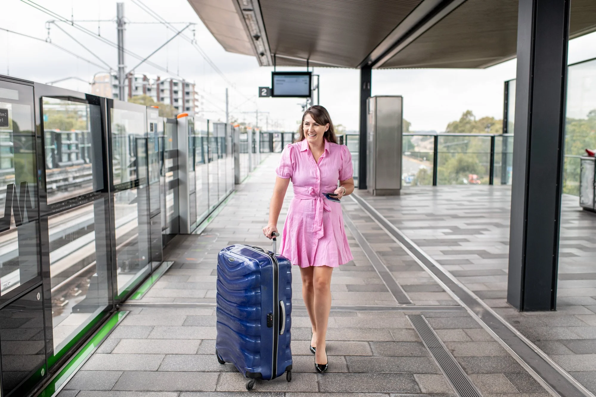
(I actually did a brand photo session at this Metro station for an amazing accountant who loves to share her love of travel!)
At the Metro station, there’s a lift, an escalator, and a staircase to help passengers get from street level to the platform two storeys above.
The lift and escalator are there for obvious accessibility reasons — to ensure that those living with mobility challenges can still access the transport service two flights up.
And the staircase is there as the functional, reliable backup in case the power goes out, there’s a fire, or a fitness fanatic wants to run off their lunch-time calories.
If the staircase was the only form of access to the platform, then a good segment of the population wouldn’t be able to use the Metro. People using wheelchairs and mobility devices would be excluded, as would those with breathing and lung issues and parents with prams, just to name a few.
As you would imagine, almost everyone uses the lift or the escalator. Not only do the lift and the escalator provide essential transport access to people with disabilities and mobility issues, but they also provide a better experience for anyone travelling.
The escalator is definitely my preferred mode of access to the train platform because:
it saves me time
it makes my journey more pleasant
it makes me want to travel more
it makes it easier for me to get to my destination
it’s helpful when I’m carrying heavy luggage
So, let’s equate these two methods of transport access to the design of your marketing material - or, in other words, the access point to your products and services…
Let’s say that marketing pieces like flyers, posters and social media graphics that are created based on ‘trends’ or the creator’s preferences on the day are the ‘staircase’. The pieces are functional and do the job, but a lot of people will find them difficult to engage with. Yes, you’ll still have some people access your offer through this form of marketing, but how many are you turning away? How many people find the design difficult to read, or are frustrated at how long it takes to understand the message?
Now, let’s say marketing pieces that are designed with intention and adherence to accessibility standards are the ‘lift’ or ‘escalator’ — catering to those with visual disability and impairment so that everyone can gain access to your products and services.
With a more considered approach to your visual communication, more people will be able to engage with your marketing because they can actually read it, your message will be clear so there’s no confusion, and your visual brand will now look professional and purposeful.
And whether the reader has visual challenges or not, you’ve just created a more enjoyable experience for potential customers by:
saving them time with your clear communication
making the buying journey more pleasant
making it easier to get to their destination (making a purchase)
and they’ll want to engage with you again in the future.
So next time you’re designing a flyer, poster or social media post for your business, ask yourself is it a staircase or a lift? Will the design help people understand your message and make it easy for them to purchase, or could it potentially be excluding a large segment of potential users and frustrating others?
If you’d like me to take a look over your current marketing designs and let you know how to make them more accessible and user friendly, let’s chat.